Best Practices
Accessible Room Displays:
ADA, Contrast, and Mounting Height
Make meeting room displays usable by everyone — ADA reach ranges, mounting height, text contrast and size, color-blind-safe status colors, and touch targets.
Short answer: An accessible room display is mounted within ADA reach range (operable parts between 15 and 48 inches from the floor), uses high-contrast, large text, doesn't rely on color alone to signal status, and has touch targets big enough to hit reliably. Most of this is a mounting-height decision plus a few display settings — not a hardware problem.
A room display sits at a doorway that everyone passes, including wheelchair users, people with low vision, and people who are color-blind. Getting accessibility right isn't just compliance box-ticking — it's the difference between a display that works for your whole workforce and one that quietly excludes part of it.
Mounting height and reach: the ADA numbers
In the US, the ADA Standards for Accessible Design set clear rules for "operable parts" — anything a person interacts with, which includes a touchscreen. The core requirement:
- Operable parts must be within a reach range of 15 to 48 inches above the finished floor for a forward or side approach.
- For an unobstructed forward or side reach, the maximum is 48 inches; the minimum is 15 inches.
- There must be clear floor space (roughly 30 by 48 inches) so a wheelchair user can approach.
The practical takeaway for a wall-mounted iPad: center the interactive area of the screen around 44–48 inches from the floor, and never so high that the tappable buttons exceed 48 inches. This is lower than many offices instinctively mount displays — eye level for a standing adult is often 60+ inches, which puts touch targets out of reach for a seated user.
If your rooms are used by the public or you're in a regulated environment, treat 48 inches as a hard ceiling for anything someone has to touch. Our mounting height guide covers the non-accessibility trade-offs too.
Clear floor space matters as much as height
A perfectly mounted display is useless if a person can't get to it. Check that:
- Nothing (a trash can, a plant, an open door swing) blocks the approach.
- There's clear floor space in front of the display for a wheelchair to pull up.
- The display isn't tucked into a narrow alcove that a chair can't enter.
Text size and contrast
Low vision is far more common than total blindness, and it's the group a display most often fails. Two things fix most of it: size and contrast.
Contrast. WCAG (the Web Content Accessibility Guidelines, the de facto standard for digital contrast) asks for a contrast ratio of at least:
- 4.5:1 for normal text
- 3:1 for large text (roughly 18pt bold or 24pt regular and up)
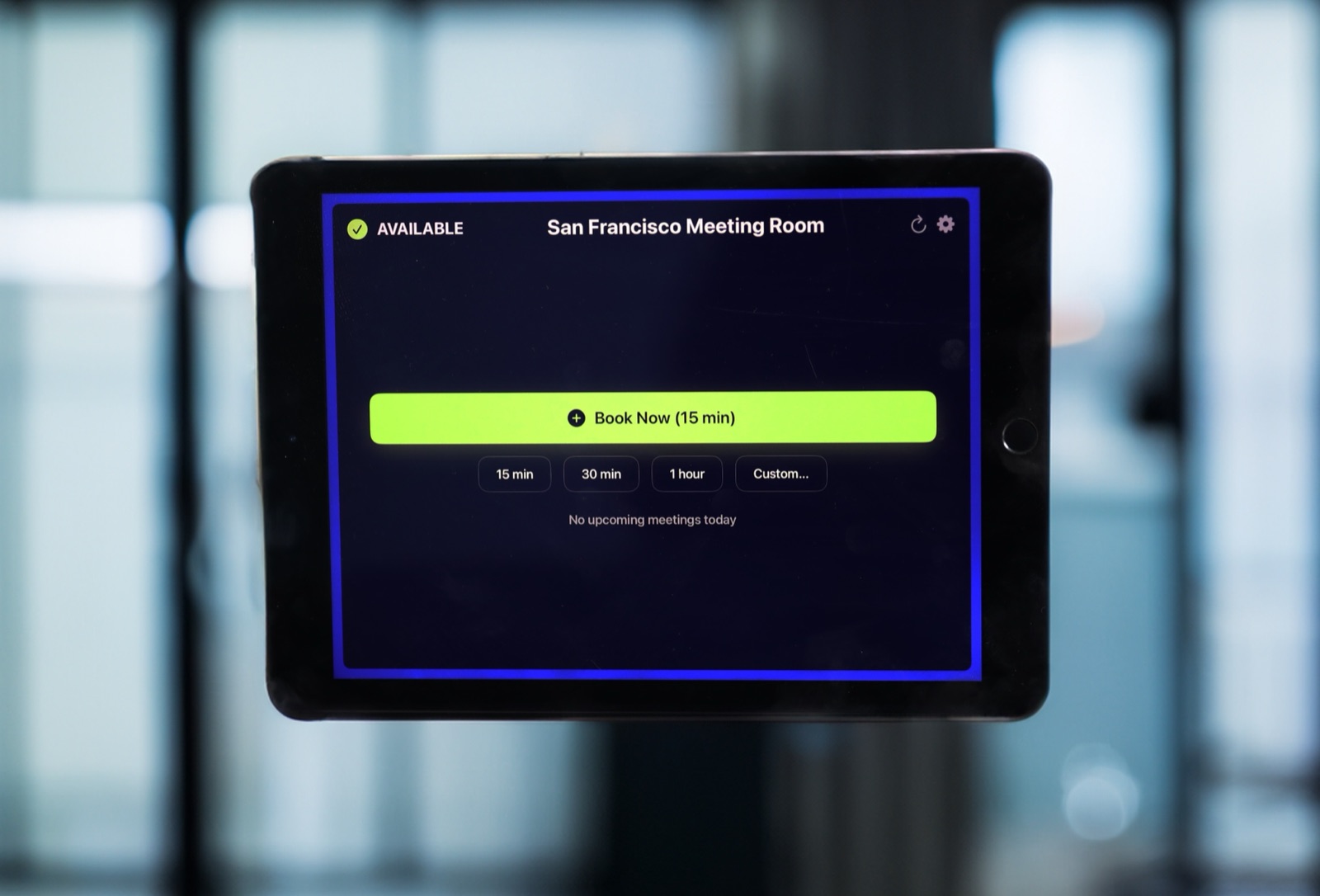
The Room Display's status screens use large, bold type on solid color backgrounds, which is exactly the high-contrast pattern that helps here. If you customize accent colors, check the result against a contrast checker before rolling it out — a trendy pastel accent can quietly drop below 4.5:1.
Size. The whole point of a room display is that it's readable from a few feet away, at a glance, by someone walking up. Bigger is better. Because the display shows a small amount of information (status, current meeting, next meeting), you can afford generous type sizes without crowding.
Don't rely on color alone
Red-for-busy and green-for-free is intuitive — until you remember that roughly 1 in 12 men and 1 in 200 women have some form of color vision deficiency. Red/green is the single most common type to confuse.
Accessible status design pairs color with a second, non-color cue:
- Text labels — "Available" / "In Use" spelled out, not just a colored panel.
- Position or icon — a consistent layout so the meaning is clear regardless of hue.
- High contrast — so the status reads even in grayscale.
The Room Display always shows the status as a word, not just a color, so a color-blind user reads "AVAILABLE" or "IN USE" directly. When you customize accent colors, keep the text labels — don't replace them with color-only indicators.
Touch target size
If a room display supports tap-to-book or check-in, the buttons have to be hittable by someone with limited dexterity, tremor, or who's reaching from a seated position. General accessibility guidance:
- Minimum touch target around 44 by 44 points (Apple's own iOS guideline), and larger is better for wall-mounted use.
- Generous spacing between targets so a mis-tap doesn't trigger the wrong action.
- Large, clearly labeled booking buttons rather than tiny icons.
Wall-mounted displays should generally use bigger targets than a handheld phone, because people tap them while standing, walking up, or reaching across.
Pair the display with tactile and permanent signage
A screen is a visual medium. For blind and low-vision users, and for resilience when a screen is off, pair each room with permanent tactile signage:
- A wall sign with the room name in raised characters and Braille, mounted per ADA sign rules (typically on the latch side of the door, with the baseline of tactile characters 48–60 inches from the floor).
- This is a requirement for permanent room identification in many jurisdictions regardless of whether you add a display.
The display handles dynamic information (who's in there, what's next); the tactile sign handles permanent identification. They complement each other.
A quick accessibility checklist
| Check | Target |
|---|---|
| Touch targets within reach | 15–48 in from floor |
| Interactive area center | ~44–48 in from floor |
| Clear floor space to approach | ~30 × 48 in |
| Text contrast (normal) | ≥ 4.5:1 |
| Text contrast (large) | ≥ 3:1 |
| Status uses text, not color alone | Yes |
| Touch target size | ≥ 44 × 44 pt |
| Tactile/Braille room sign present | Yes |
Frequently asked questions
How high should an accessible room display be mounted?
Mount it so all touchable controls fall within the ADA reach range of 15 to 48 inches from the floor — in practice, center the interactive area around 44–48 inches so a seated user can reach every button.
Does a room display need to meet ADA standards?
If it's an interactive control in a US workplace or public building, its operable parts should meet ADA reach ranges. Pair it with permanent tactile/Braille room signage, which is separately required for room identification in many jurisdictions.
What contrast ratio should room display text use?
Follow WCAG: at least 4.5:1 for normal text and 3:1 for large text. Check any custom accent colors against a contrast tool before deploying them.
Is red/green status accessible for color-blind users?
Not on its own — red/green is the most commonly confused pair. Always pair color with a text label like "Available" or "In Use" so the status reads without relying on color.
How big should the booking buttons be?
At least 44 by 44 points (Apple's iOS minimum), and larger for wall-mounted use, with generous spacing so people can tap accurately while standing or reaching from a chair.
Related guides
- Where to mount a meeting room display
- Best iPad wall mounts for conference rooms
- What a genuinely good room display looks like